Introduction
A while ago I wrote about the concept of the Cosy UX, and how little elements of an interface contribute to the overall ‘take-away’ feeling a user has about an experience.
Recently my wife started playing the Nintendo Switch game Animal Crossing again and it reminded me just how good an example of this cosy concept it is.
I’ve attempted to break down some of the reasons I think this game is considered one of the quintessential ‘cosy’ gaming experiences.
About The Game
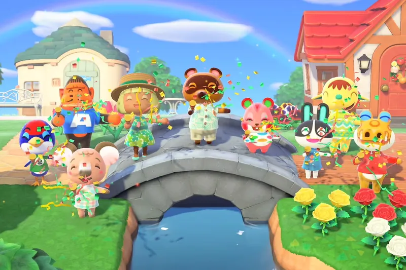
Released in March 2020 just as the UK lockdown started and coinciding with large portions of the world also being asked to stay indoors to curb the spread of the Coronavirus, Animal Crossing: New Horizons for the Nintendo Switch offered an escape to those otherwise unable to escape.
Taking on the role the only human inhabitant of an animal world, you move to an island and help to establish a community by building amenities, talking to other residents, and many many other things which I won’t go into here.
Each and every activity you do is very relaxed, there’s no fighting or really any sort of competiton in this game, you can’t lose. It’s designed to be casual and relaxing, and it is, it’s a good game, go play it.
The Interface
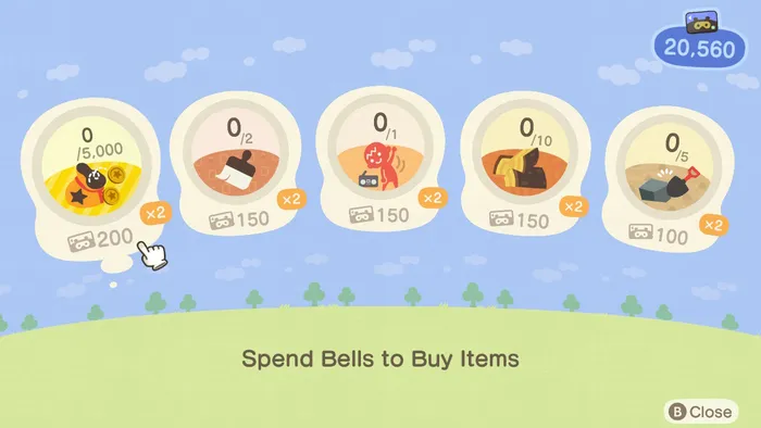
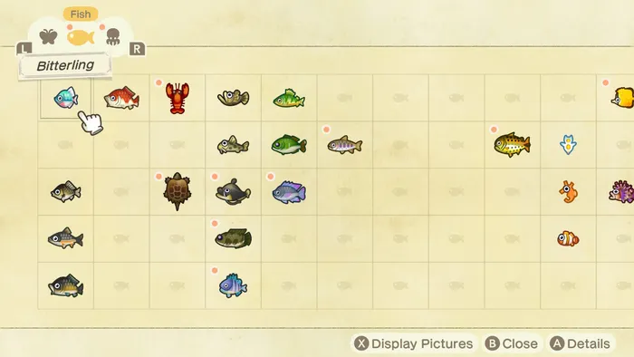
It’s a cute game, and the interface follows suit. The whimsical design language is led with the use of lots of pastel colours, creating a sense of joy, even when navigating menus.
Chunky icons, rounded corners and friendly fonts are the name of the game here - I’ll go through some of the key aspects of the UI which contribute to the cosy feeling of the game.
Colours
Consistent use of pastel colours maintains the whimsical and relaxed experience of the game. Less saturated colours help to create a more subdued and less intense experience for players.
It also means that when stronger colours are used they stand out much more than they might otherwise.
Motion Is a Drug
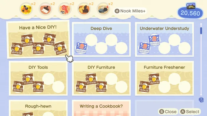
An intrinsic part of the Animal Crossing: New Horizons UI is the motion design. It’s prevalant in almost all areas. Icons bounce with delight as you select them, the momentum of each movement has been calculated perfectly to give a sense of satisfaction to each choice you make in the menu system.
The menu paradigm in New Horizons is one of a mobile phone, each feature is presented as an app on your in game mobile. To select an option, you move the highlight across the rows of icons, as you highlight each option an indredibly satisfying animation plays.
The reason these are so satisfying in my opinion is that they are very pleasingly weighted. As you can see in the video above, the ‘Nook Miles’ icon for example, has an almost musical beat to the way the racoon runs across the globe.
The motion isn’t just visually smooth; it carries a sense of playful momentum, all contributing towards the handcrafted aesthetic of New Horizons.
Each animation across the game follows this principle, all designed to seem as if they’re following the laws of physics, but also maybe in a slightly exaggerated way. Like gravity has been turned down a notch. It’s subtle, but it’s just enough to make each sequence of motion seem slightly unusual – and in a way, more alive.
One aspect of the game has you collecting tokens, you have to complete challenges which need redeeming in a menu before you can access the rewards.
It’s a drug, and an effective one at that
As you click to redeem each rewards, one of these momentum filled slightly weightless animations plays, a sound dings, and immediately seratonin in quantities never before known to science are being released into your brain – and you just want more of it.
It’s a drug, and an effective one at that. Not a bad way to bring people back to play your game.
Sound Design
The pops, clicks, chimes and other sounds of New Horizons are designed to compliment the cute interface. They match the animations for the most part, providing satsifying feedback for interface actions.
They also act as subtle prompts to guide the player in how to react to feedback from the game. When something goes wrong in game you hear an alert noise which reinforces that something needs your attention. When something goes well, you’ll hear a sound which sounds very similar to someone saying ‘Wahoo!’.
Bringing It All Together
Each and every aspect of this game’s UI works together to provide a consistent experience, and this in itself gives the user a sense of security and, that magic word cosiness.
I think for me, what marks New Horizons above other similar games are the UI animations, but it’s not just that.
There’s something about a well made experience that naturally affords a feeling of security and relaxation. This in my opinion comes from the feeling that you know what to expect from the UI. The whole experience contributes to this feeling for a user, even encompassing the functionality of the application being used. If you’re sure clicking a button will actually perform the action you want, and It doesn’t glitch or break.
The game was released in 2020, a time in which we all needed somewhere to go to be reassured. Well, here we are 5 years on, and somehow we find ourselves needing the exact same thing again.
New Horizons achieves the key feeling of security. The UI anticipates what you might do and when you might do it, and provides an incredibly satisfying mix of animation, sound and visual feedback when you decide to take action.
